Past Projects
Explore our past work to become inspired, see what we are capable of, and see how we may elevate your brand.
Organize past projects with the words below

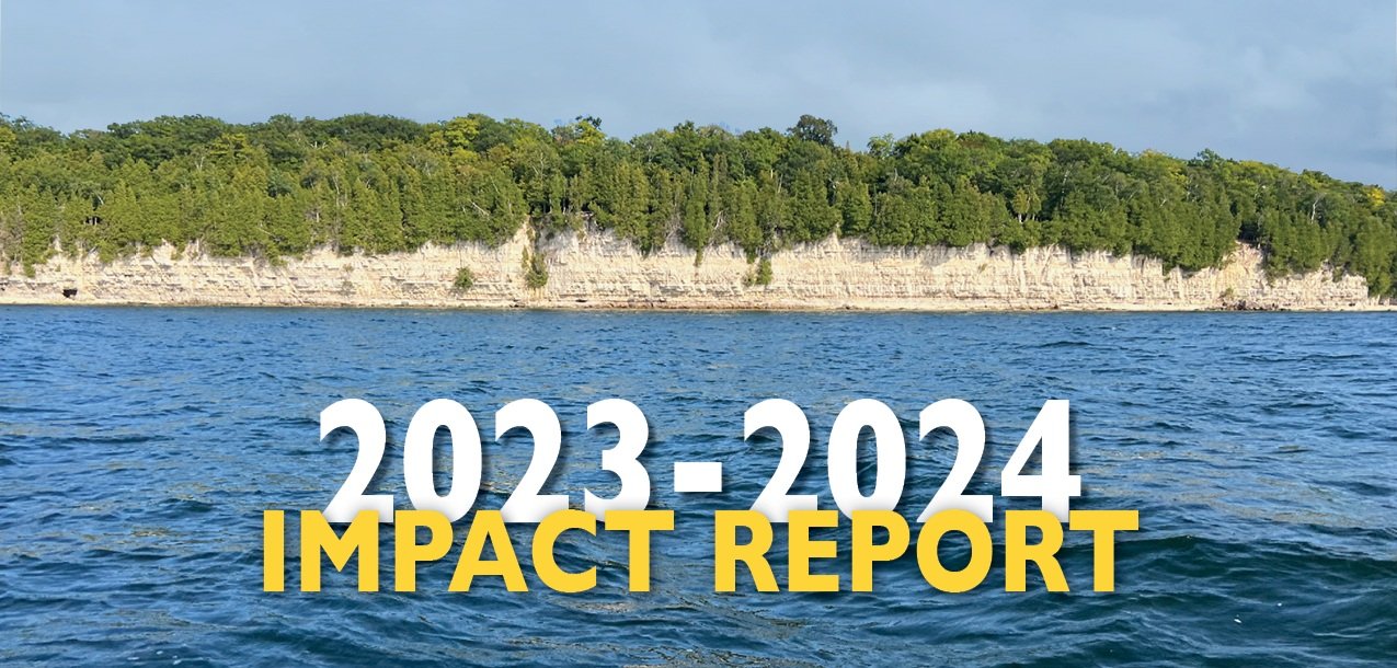
LNRP 2023-2024 Impact Report
ZFMK Creative was selected by Lakeshore Natural Resource Partnership (LNRP) to design their 2023-2024 Impact Report—a comprehensive six-page document that showcases the organization’s conservation efforts, partnerships, and financial transparency. Our goal was to create a visually compelling, functional, and engaging report that aligns seamlessly with LNRP’s brand while making complex information accessible to their stakeholders.

Sunday Service with Tech Metropolitan
Tech_METROPOLITAN (TM), inspired by its founder’s Louisiana roots, creates inclusive spaces for Baltimore’s queer community to celebrate art, culture, and individuality. ZFMK Creative designed adaptable graphics for TM’s "Sunday Service" event, including a rainbow disco ball and radiant light shards, with plans to expand these assets and continue supporting TM’s creative initiatives.

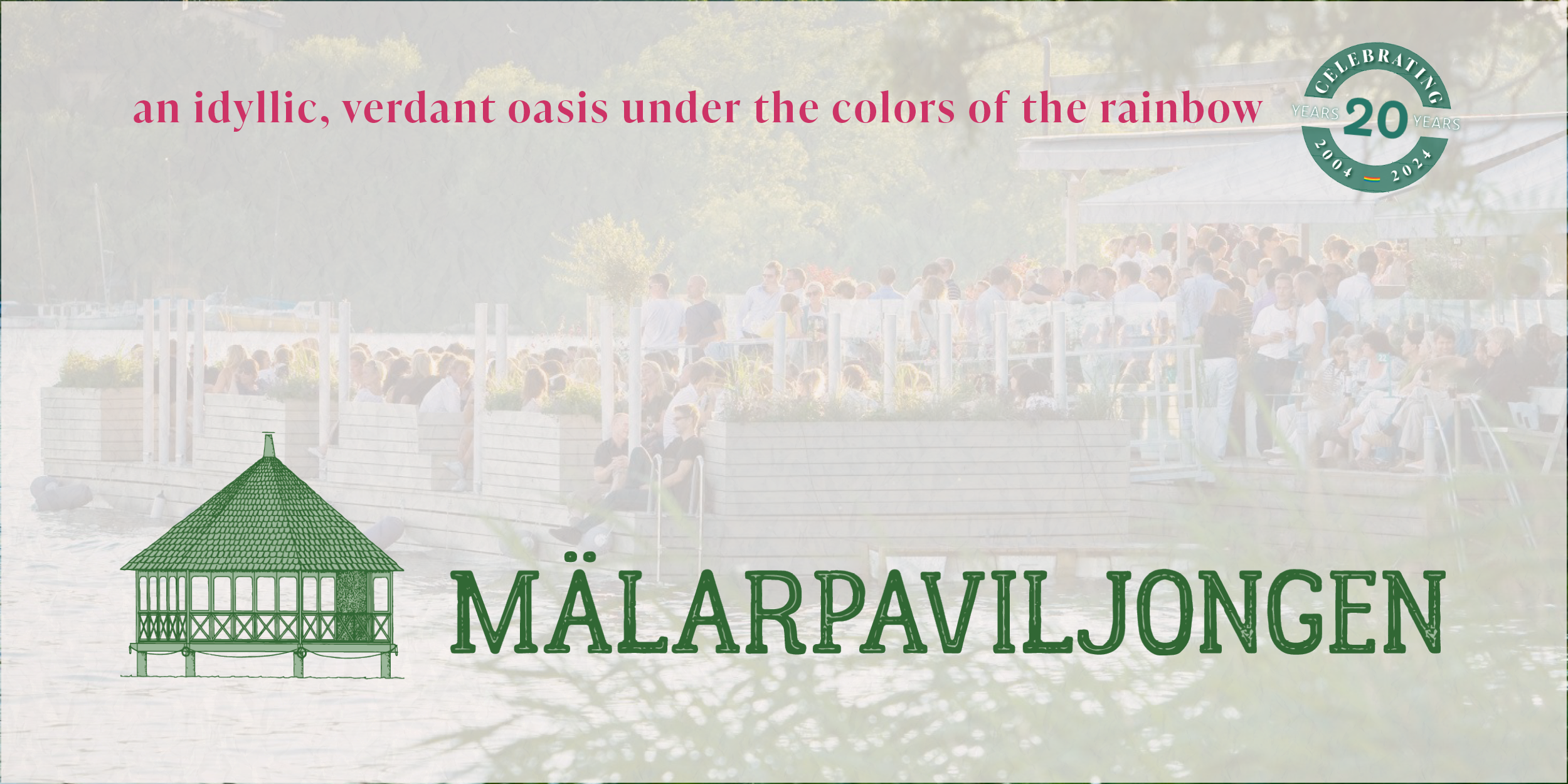
Refreshing Mälarpaviljongen: Elevating the Brand Experience
In preparation for the twentieth season, we undertook a comprehensive rebranding effort to refresh the iconic Mälarpaviljongen logo to enhance visual appeal and functionality. By integrating a cohesive color palette and versatile logo designs, we successfully elevated Mälarpaviljongen's brand experience, aligning it with their identity and customer expectations. The project also involved developing content standards and templates for their social media channels to ensure consistent and high-quality engagement across platforms. View the newly refreshed identity of a beloved Stockholm restaurant.

From the Ground Up: Renewed Menus for Mälarpaviljongen's Milestone
In celebrating its two-decade milestone, Mälarpaviljongen undertook a comprehensive menu revitalization, aligning with its commitment to bringing people together and creating an exceptional waterfront experience. Inspired by the venue's distinctive locale, the menus feature a harmonious blend of typographies and colors, while iconic symbols pay homage to its verdant surroundings. Looking ahead, the integration of supporting motifs promises to fortify brand identity across various graphics, fostering a cohesive and immersive dining experience for guests throughout the 2024 season and beyond.

English Bull Dog to Represent The Brinsmere Funds
This logo design showcases the iconic English Bulldog, symbolizing trust, forward-thinking, and approachability. In this project, we've meticulously crafted three dynamic logo versions - the standout icon, a sleek ribbon for official documents, and a bold stacked version. Our design choices prioritize high visual appeal, ensuring a strong online presence that is perfect for social media engagement. With a color palette inspired by trust and professionalism, and a clean aesthetic against a white backdrop, this logo embodies our commitment to financial stability and innovation. Dive into our project to witness how our branding captures the spirit of The Brinsmere Funds.

Creating a Livable Brand for Cherokee Island
Wesenberg Homes' logo for Cherokee Island encapsulates the essence of wooded waterfront living on Lake Winnebago, Wisconsin, through its thoughtful design. Inspired by the lush landscape, the circular arrangement of leaves symbolizes the abundant natural beauty and growth of the development, while the encompassing blue rings evoke the serenity of the surrounding water and recreational opportunities. With three distinct logo versions tailored for various contexts, Cherokee Island's branding captures the harmonious blend of nature and modern living, promising an idyllic retreat for residents.
