Refreshing Mälarpaviljongen: Elevating the Brand Experience
CLIENT
Mälarpaviljongen
LOCALITY
Stockholm, Sweden
DATE
March 2024
CATEGORY
Branding
TYPE
Graphic Design, Graphics, Logo, Branding
PACKAGE
Website - Y
MEDIUM
Digital
STATUS
Completed
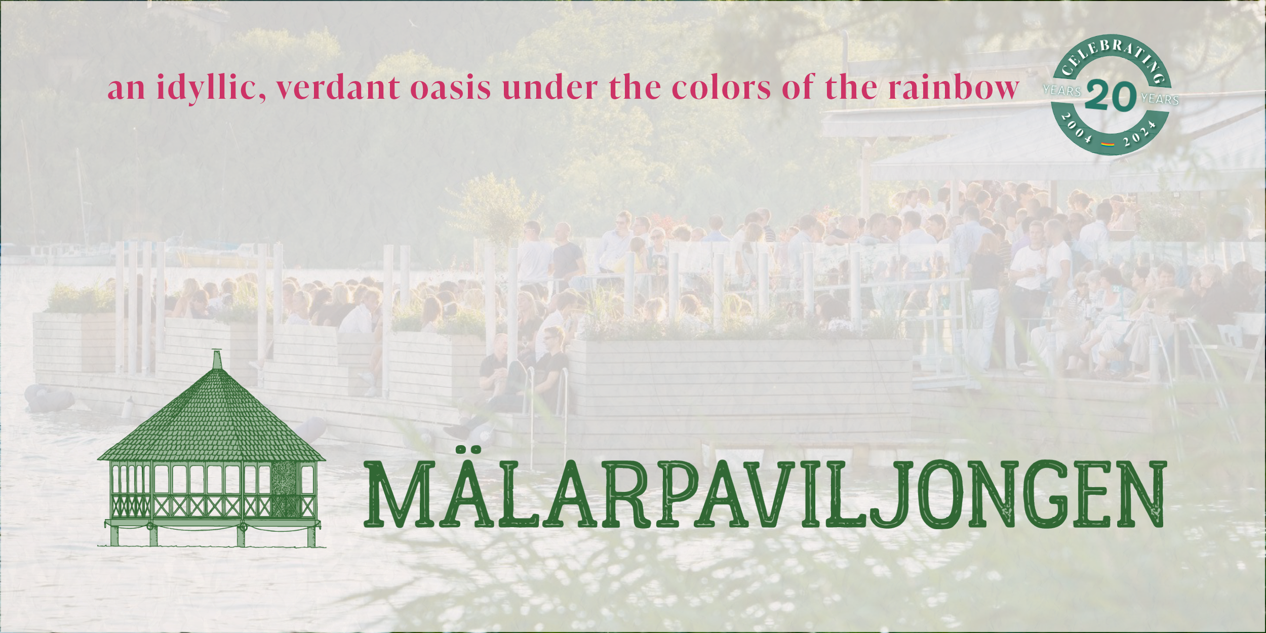
In preparation for the twentieth season, we undertook a comprehensive rebranding effort to refresh the iconic Mälarpaviljongen logo to enhance visual appeal and functionality. By integrating a cohesive color palette and versatile logo designs, we successfully elevated Mälarpaviljongen's brand experience, aligning it with their identity and customer expectations. The project also involved developing content standards and templates for their social media channels to ensure consistent and high-quality engagement across platforms. View the newly refreshed identity of a beloved Stockholm restaurant.
ORIGINAL DESIGN + IMPROVEMENT Areas
For the rebranding project undertaken for Mälarpaviljongen, we embarked on a comprehensive refresh of their logo to increase its functionality, enhance visual appeal, and elevate the brand experience for their customers. The original logo (shown in black and white) served as the restaurant’s main identity symbol for many years. It was derived from a construction document set of the historic pavilion and prominently featured an elevation of the building. However, the design suffered from a skewed appearance, as the iconic pavilion seemed slightly rotated over straight text, which detracted from its overall impact. Additionally, the logo was provided in two image files (black and white) that were not in vector format, posing risks of pixelation and limiting their versatility. The lack of a secondary color also led to a loss of detail, causing the pavilion to blend into its background in specific uses. Beyond the logo, there were no established colors, fonts, or supporting symbols to help complete the visual identity.
REFRESHED LOGO DESIGN
To address these issues, we developed a vector-based, two-toned logo that preserved the essence of the original while improving its clarity and adaptability. By rectifying the slanted or rotated elements, we ensured that the pavilion's elevation was portrayed accurately and with greater visual stability. We also introduced the flexibility to separate the iconic pavilion from the complete drawing, allowing for its application in diverse contexts and in creating the icon version. To further enhance usability, we created multiple versions of the logo—colored, black, and white—ensuring that it remains legible and effective across various media. The waterline element is now a supporting symbol that can be easily integrated into marketing materials and graphics, enhancing the brand’s visual coherence and identity.
The color palette for Mälarpaviljongen is inspired by hues from its previous website, with specific names and color codes to ensure a unified look across all marketing materials. A standout color is Mughal green (#336633), inspired by the City of Stockholm's park bench color, which serves as the primary shade in the palette. This green symbolizes growth and prosperity, aligning with the restaurant’s lush gardens and welcoming ambiance. Complementing Mughal green is Laurel green (#9BB89B), which is used to add contrast and is featured in the primary logo design. The palette also includes telemagenta (#CC3366) for vibrant floral accents and iceberg (#74B3CE) to evoke the nearby Mälaren waters. Lastly, seashell (#FAF2EF) is used as a background color, offering a warm undertone that reflects the restaurant’s historic charm and typewriter menu aesthetic.
ICON
The icon version of Mälar’s logo is a standalone representation featuring the distinct and historic pavilion elevation drawing. At the base is the supporting symbol water line used throughout the branding and marketing. This iconic elevation is intended to be versatile and impactful on its own, conveying the brand's essence without the need for accompanying text. The pavilion's clean design and high visual aesthetic make it perfect for a range of digital platforms, mainly social media, where a visually appealing and recognizable image is crucial for leaving a memorable impression. Against a white background, this icon version exudes clarity and sophistication, ensuring a compelling and consistent presence across various digital landscapes.
RIBBON (HORIZONTAL)
The ribbon or horizontal version of Mälar’s logo is a great alternative to the primary or stacked design. This version encapsulates the brand's essence through a sleek and concise horizontal bar design featuring the historic pavilion elevation drawing icon. The horizontal orientation of the logo's design optimizes space utilization, making it ideal for official documents, letterheads, and other official communications. This design may be used with or without the icon, where just the iconic text of the logo is necessary or when the icon appears too small to recognize. The simplicity and professionalism conveyed by this design, especially when placed on a white background, underscore the restaurant’s commitment to growth and prosperity.
PRIMARY (STACKED)
The primary or stacked version of Mälar’s logo nods back to the previous logo design but with refreshed branding and in vector form. This arrangement highlights the full pavilion elevation drawing by showing the pedestrian bridge from Mälarstrand to the waterfront pavilion. Similar to the original design, the name “Mälarpaviljongen est. 2004” is below the pavilion elevation in the same color and width. This version of the logo is perfect for various applications, including videos, apparel, and posters, where the complete representation of the organization is crucial. Against a white background, the logo's powerful visual appeal is further emphasized, capturing attention and effectively communicating the brand's message in diverse and dynamic contexts.
BOLD
This version may be used for more bold applications and uses. The design emphasizes the visual aesthetic while adding text to identify Mälar. The design allows the icon to be recognized from a distance while providing the name of the business in smaller letters for viewers to read when closer. This is great for videos, apparel, and posters.
SUPPORTING SYMBOLS
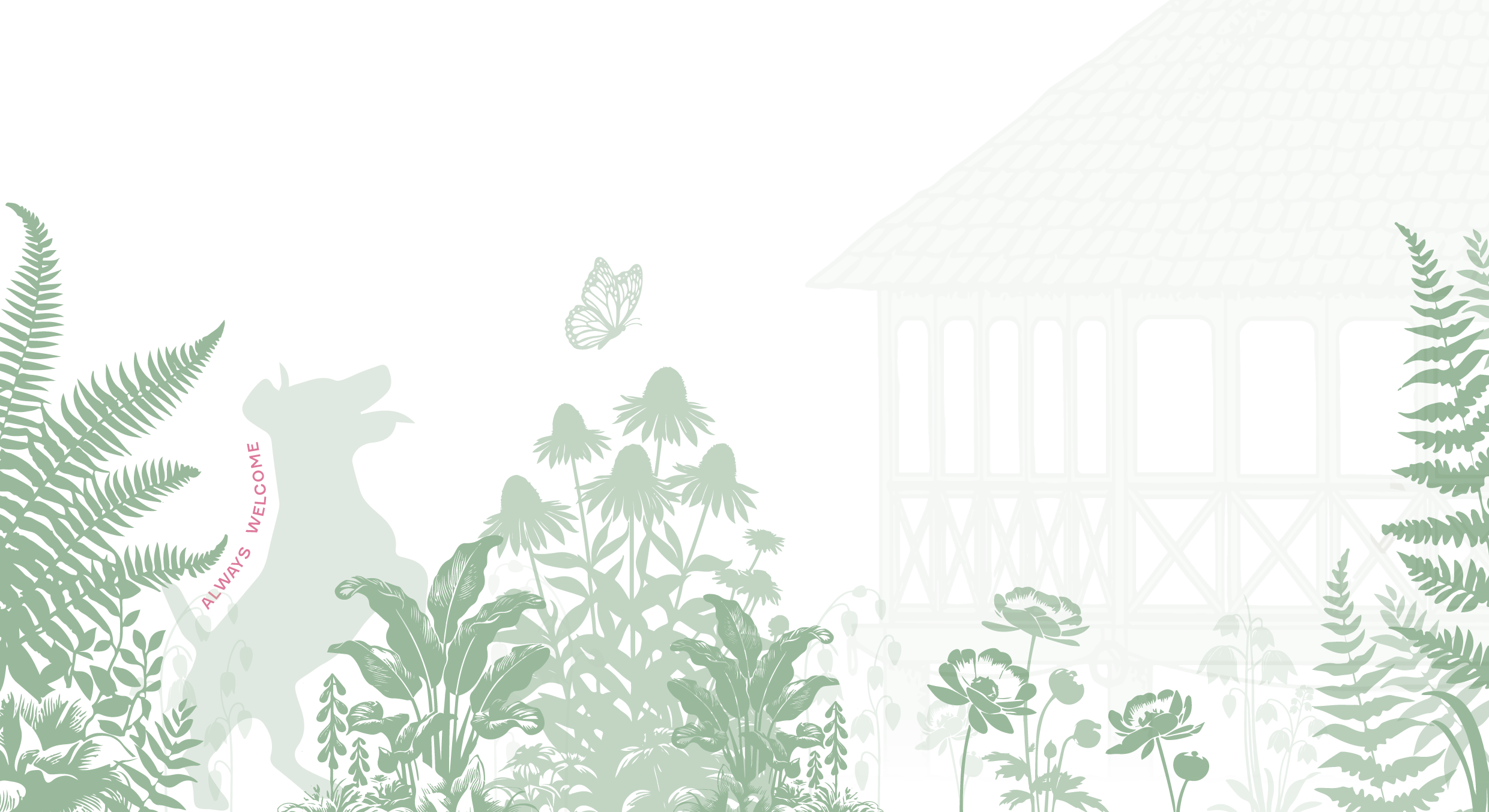
Enhancing their brand's visual narrative, Mälarpaviljongen features a collection of supporting symbols to complement their main graphics and elements. Discover an array of two-toned graphics, including flowers, plants, butterflies, and our beloved canine companion (that are always welcome onsite). These symbols, designed to enrich their brand identity, evoke feelings of joy, tranquility, and connection with nature. Together with the other branding elements, these symbols may be seen on the restaurant’s menus, graphics, and website, all reinforcing the brand and letting viewers know they are at Mälarpaviljongen.
Content + Content Streams
In today's digital age, social media has become an indispensable tool for businesses and brands to connect, engage, and build relationships with their audience. As we navigate the ever-evolving landscape of social platforms, it's crucial to maintain a consistent voice and visual identity across all channels. To better organize and promote Mälar’s activities, we focused on five key social media content types and matched each type with one of the brand’s colors.
Purpose: Our purpose drives everything we do, and we use this space to share behind-the-scenes moments, achievements, and our history. This content includes a look at our awards, accomplishments, and the stories behind our brand.
Events: We frequently host events for our guests to enjoy, and here we share information about these events along with live updates. This includes promotions, entertainment, DJ performances, and what's next on our calendar.
Garden: Our well-tended garden is a favorite among our guests, and we highlight what’s growing or blooming, along with shots of the property and updates on the current weather.
Drink: We offer a variety of beverages, from alcohol-free options to signature cocktails. This content features our selection of cocktails, mocktails, wines, and other alcohol-free drinks.
Food: Our menu is a mix of guest favorites and new featured dishes. Here, we highlight everything our guests might enjoy, including lunch, fika, brunch, dinner, and special featured dishes.
We created strict content standards to ensure the quality and consistency of their social media presence. We encouraged them to share only high-quality content on official posts, ensuring each piece aligns with one of our five designated content streams. Each post should also utilize the specific color associated with its content type, reflecting and integrating more deeply with official branding. Every post must include a caption inviting user engagement and clearly describing shared content.
We created content templates for team members and made them available in the company’s online Workdrive to streamline their social media efforts. These templates are designed to simplify posting for recurring events such as closures, announcements, or fun updates. If a necessary template was not available or for something frequently used, it was easy to add it to their collection. For added convenience, we recommend downloading the "Adobe Express" application on employee phones, which offers easy-to-use, drag-and-drop templates for quick content creation.
