Past Projects
Explore our past work to become inspired, see what we are capable of, and see how we may elevate your brand.
Organize past projects with the words below
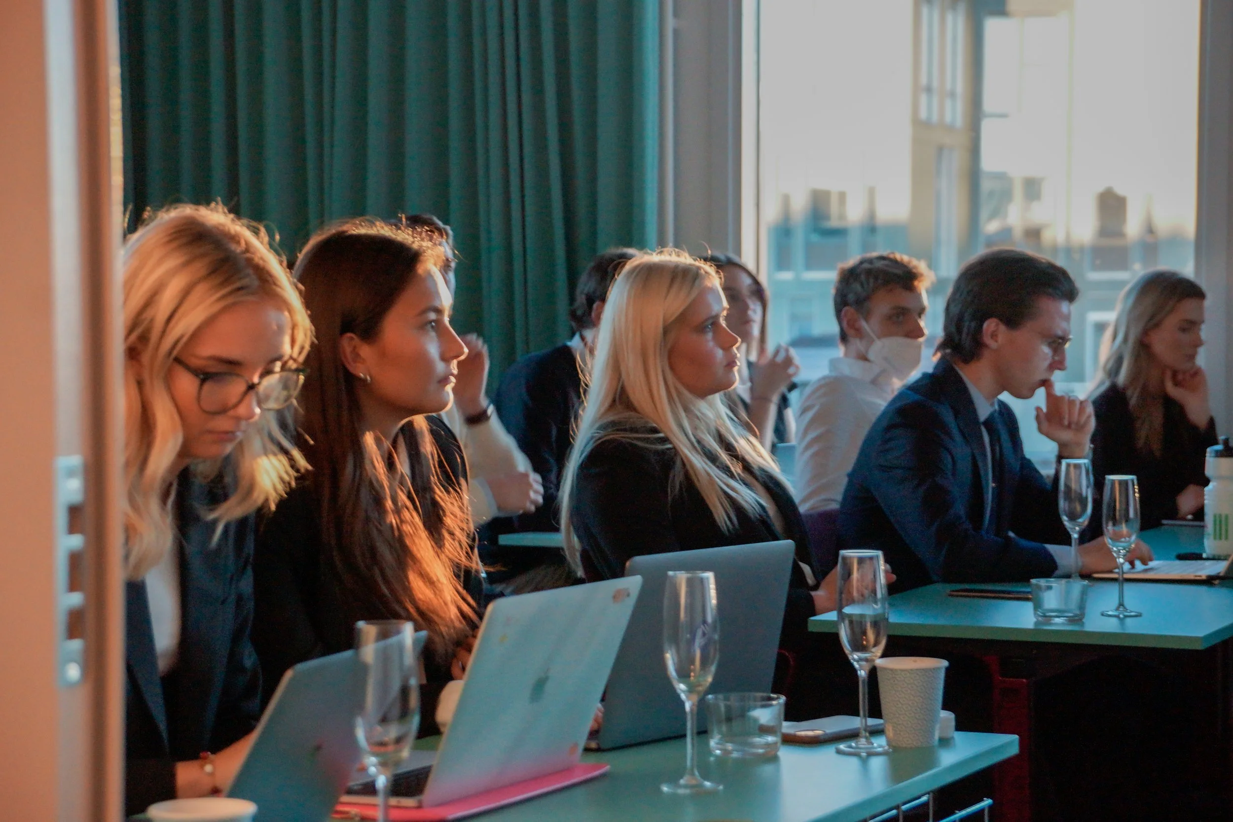
KTH REC's Case Release Event
The Real Estate Case Competition organized by KTH Real Estate Club (REC) is an annual event in October. This year the organization used ZFMK Creative to help capture the release event one week before the competition. The main goals of this event’s pictures were to tell the story of the student teams learning through the seminars, networking with each other and the presenters, and capturing a picture of each team at the conclusion of the event.
Oz Logo + Branding
Ozaukee County Watershed Coalition was a young organization looking to build branding to better establish itself in Wisconsin. Seeking a logo and branding to help ensure future growth is done with one voice and be recognizable to the communities it serves was at the foundation of discussions. The finalized design pulls from the layers within a watershed and shows the layers beneath the ground that help purify and hold the water people enjoy at the surface.

Saturated Labels
Your taste buds will be Saturated after enjoying this ice cream with labels designed by ZFMK Creative. With an idea from the leadership at this plant-based ice cream company in Nashville, a scalable and easily editable container label template was created.

Reconnecting with Friends of Hika Bay
Friends of Hika Bay was looking to upgrade their ten-year-old website to better tell their journey of conservation of Hika Bay and the connected waters.

Editing Emma Talks Architecture
ZFMK Creative was delighted to collaborate with Emma Talks Architecture on a comprehensive project to create visually stunning videos for their monthly interview series blog. Our team designed both intro and extro graphics, created branding elements, edited footage, adjusted sound and color, and uploaded 23 videos to the client's YouTube channel.

Friends of Stony Brook Website
Crafting more than a visually appealing one-page website, our work with Friends of Stony Brook transcended design to embody their environmental commitment in a user-friendly digital experience. Utilizing our carefully crafted branding elements – from the color palette to the integration of fonts – the design achieved a harmonious blend of modernity, sophistication, and reliability. The interactive platform not only informs but engages visitors, inviting them to explore Stony Brook's history and initiatives, fostering a deep connection to the organization's vital role in preserving this natural gem.
Friends of Stony Brook Logo + Branding
Friends of Stony Brook had been around for a number of years but was seeing more attention and growth in recent years. The organization was seeking a logo and branding to help ensure this growth was done with one voice and be recognizable to the communities it serves. The end result incorporates many elements from the activities within Stony Brook and accentuates the protection, education, and restoration of the area.

Saturated Website
Saturated Ice Cream out of Nashville, Tennessee, was seeking help to get their website up and running through the finish line. ZFMK Creative helped by assisting with getting everything in order and in the creation of their online store. While this website is no longer live, the company still utilizes Instagram as its home base online.
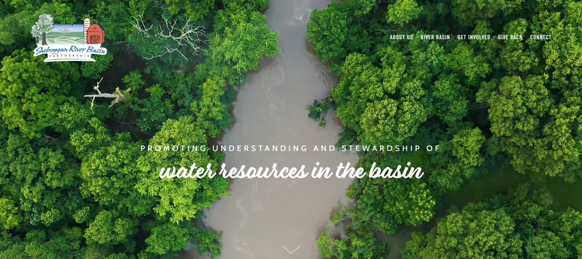
Promoting Understanding and Stewardship Online with Sheboygan River Basin Partnership
Promoting understanding and stewardship of water resources in the basin is now much easier with the completion of this online property. Completed with water quality reports, interactive mapping, and the history of the non-profit are just a few components within.
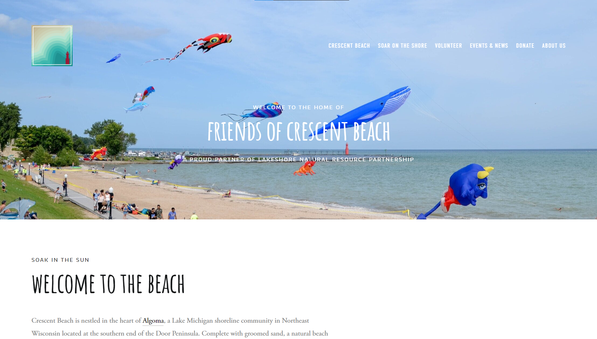
Web at the Beach: Friends of Crescent Beach Website
Friends of Crescent Beach sought an online property with the ability to organize their volunteers, gain new followers, and showcase their beach on Lake Michigan. With great digital assets including pictures, video, and graphics, this website really makes waves.
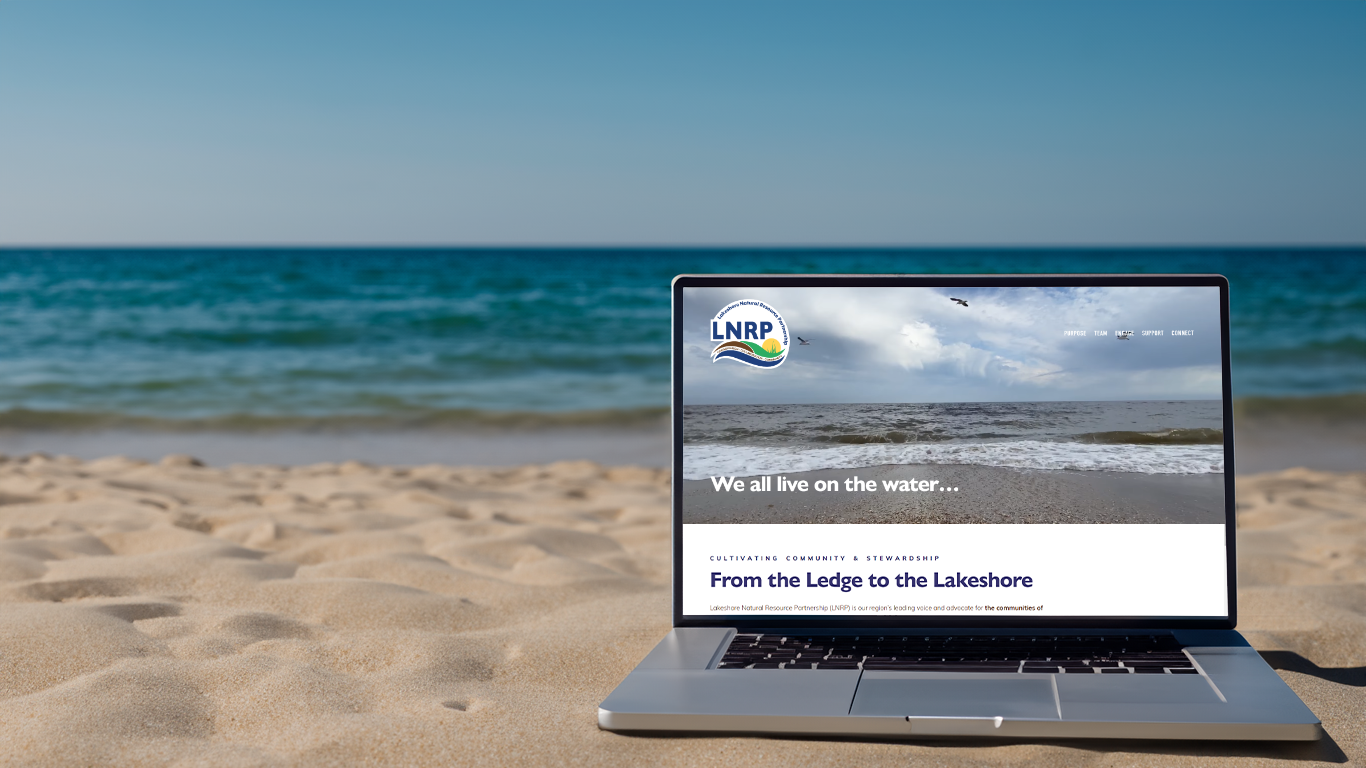
From the Ledge to the Lakeshore, a New Landing for LNRP’s Website
LNRP, a large umbrella non-profit, was seeking to refresh its outdated website with something that would get people engaged, provide benefits to their partners, and improve their conservation efforts in Northeast, Wisconsin. ZFMK Creative helps continue this transformation each year with larger updates and new features.

Saturated Logo
Saturated Ice Cream out of Nashville, Tennessee, was seeking help to create a scalable vector file of their existing logo and to help with usage guidelines. A branding guide was established with the current colors, fonts, and usage of the logo so that future use could be achieved at any scale.

Wandile Mthiyane’s Speaker Sheet
We're excited to highlight Wandile Mthiyane, founder of Ubuntu Design Group (UDG), Ubuntu Architecture Summer Abroad Program (Ubuntu ASAP), and The Anti-racist Hotdog. Wandile's organizations are dedicated to social impact design, with a focus on creating dignified work-live homes through their Ubuntu Home concept and limiting segregation. As a speaker, Wandile's message centers around the power of listening to build better communities, understand diversity and inclusion, and lead with Obama-inspired leadership.
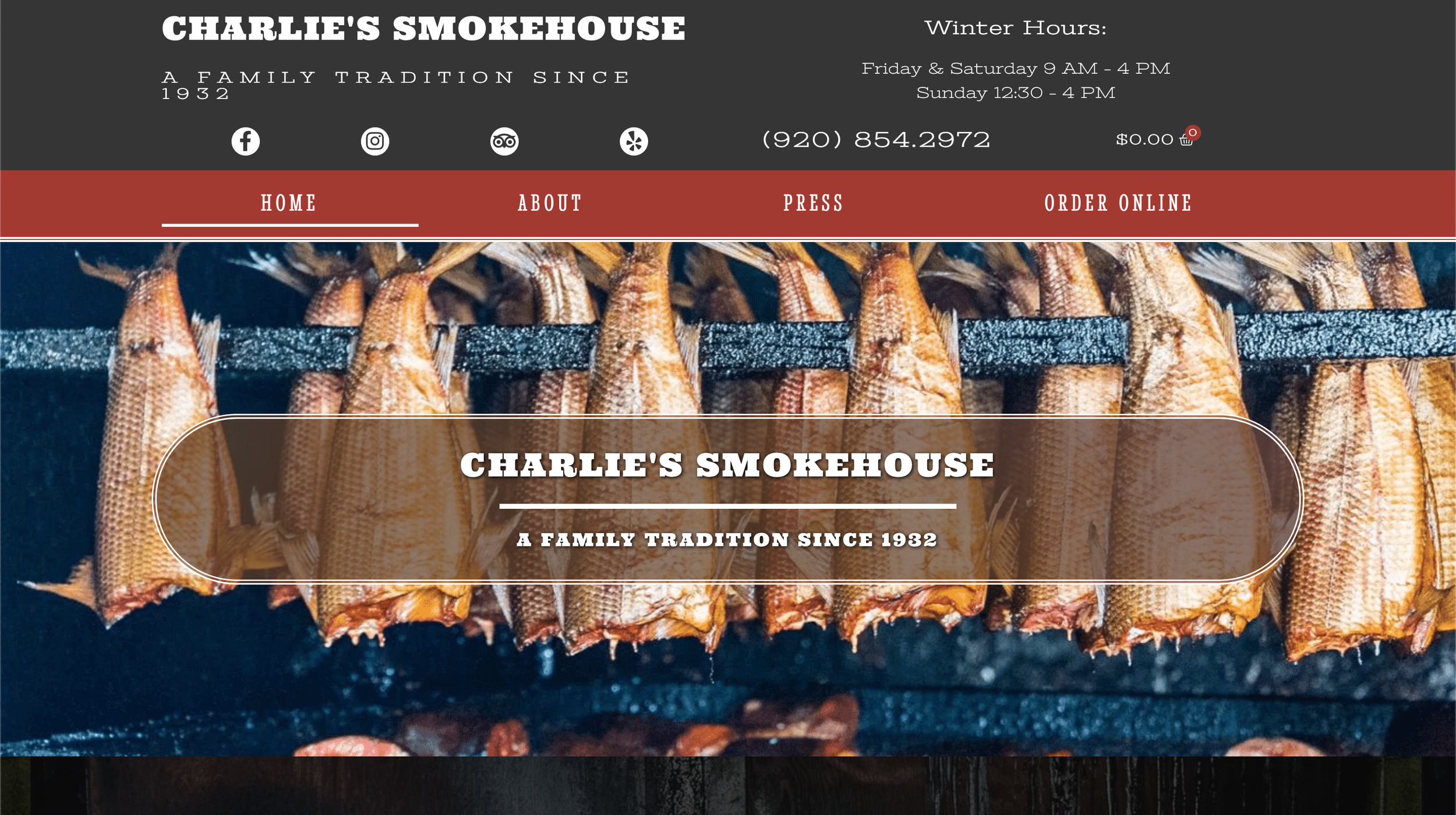
Organizing Charlie’s smokehouse website
Online properties can be a great resource for small businesses to utilize but can often be hard to learn the website builder. With this project, the current Charlie’s Smokehouse website was refreshed and brought to life with an online store, product descriptions, and a mobile version with an online ordering menu.

Creating a Livable Brand for Cherokee Island
Wesenberg Homes' logo for Cherokee Island encapsulates the essence of wooded waterfront living on Lake Winnebago, Wisconsin, through its thoughtful design. Inspired by the lush landscape, the circular arrangement of leaves symbolizes the abundant natural beauty and growth of the development, while the encompassing blue rings evoke the serenity of the surrounding water and recreational opportunities. With three distinct logo versions tailored for various contexts, Cherokee Island's branding captures the harmonious blend of nature and modern living, promising an idyllic retreat for residents.

Casey’s Meadow Logo
Introducing the Casey's Meadow logo by Wesenberg Architects, a seamless blend of simplicity and sophistication. The intertwining 'C' and 'M' symbolize the unity of community within this vibrant Oshkosh subdivision, while the golden hues evoke the serene beauty of the meadow, complemented by hints of blue reminiscent of nearby Sawyer Creek. Reflecting the essence of relaxed living and thriving families, our logo encapsulates the essence of Casey's Meadow, where new additions flourish amidst picturesque surroundings.
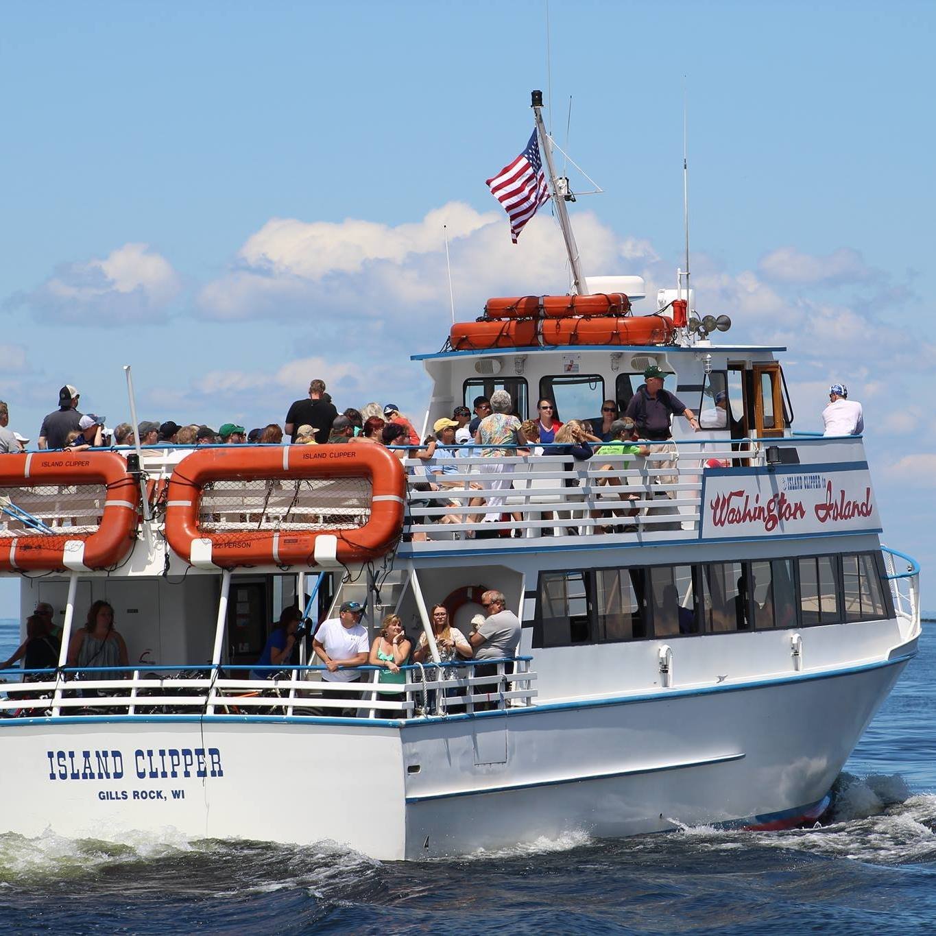
Island Clipper Ferry Website
A community favorite for traveling between the Door Peninsula and Washington Island was seeking to provide an online web experience for their customers and tourists to gain information about their fleet, schedule, and touring trains on the island. Island Clipper Ferry to Washington Island had a handful of custom elements created for their website to help it stand out and help tell its story.
A French-Wisconsin Cafe Through Media
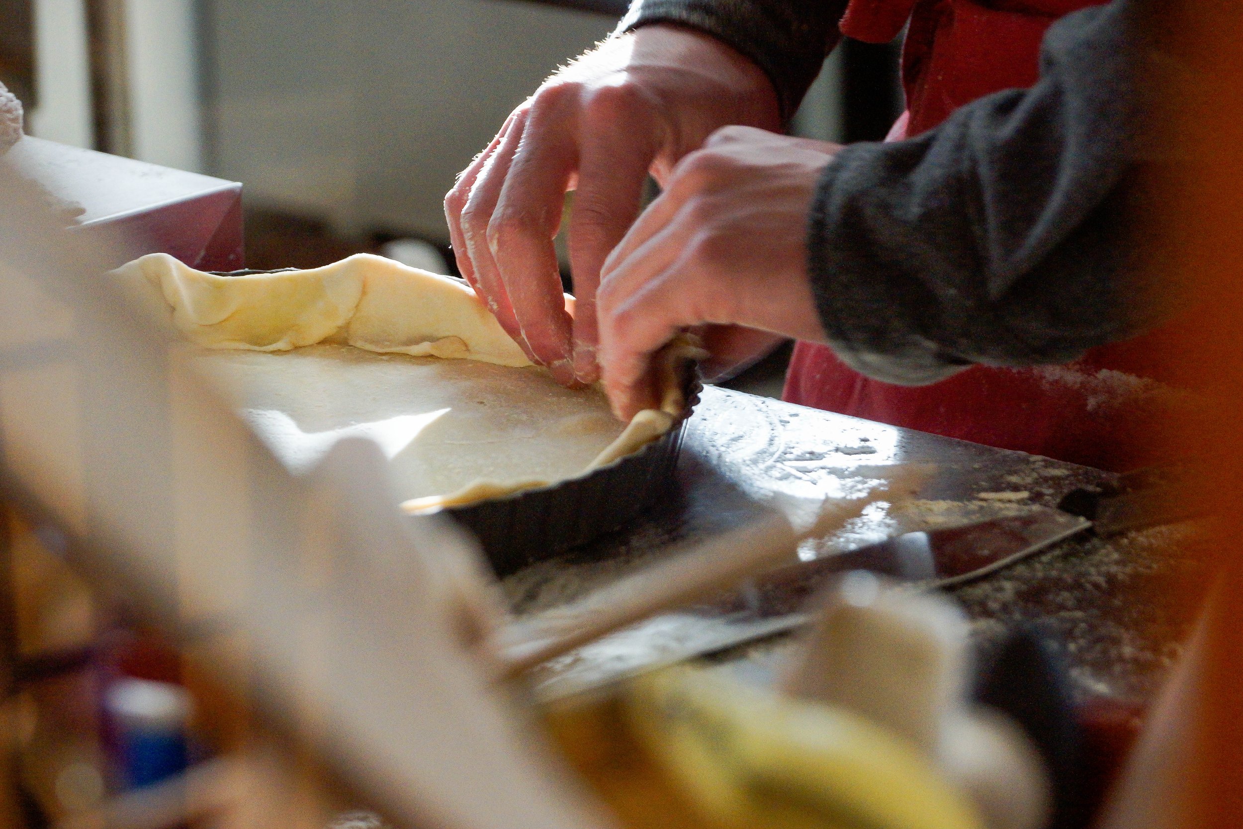
One of the firm’s first projects was in modernizing a popular cafe in the heart of the Door Peninsula, a thriving tourist destination surrounded by nature. Through solidifying Base Camp’s brand elements, re-inventing its online footprint, and creating an abundance of content to show what Base Camp provides to the community. This project took a few years to complete with planned sessions to capture the honest and compelling narrative of a French-Wisconsin-inspired culinary experience that brings many together.

Cultivating a brand: Door County Thrive
Through collaborative dialogue with Door County Thrive's leadership, we embarked on a creative journey to craft a logo and brand reflecting their diverse community and shared mission of empowerment. Established in 2017 by passionate volunteers, Door County Thrive aims to cultivate eco-literacy and foster community collaboration for the greater good. Our logo, symbolizing unity and growth, embodies this vision, offering versatility across various platforms while preserving its significance for official communications and documents.
Reflections of Autumn with Discourse Moonwater
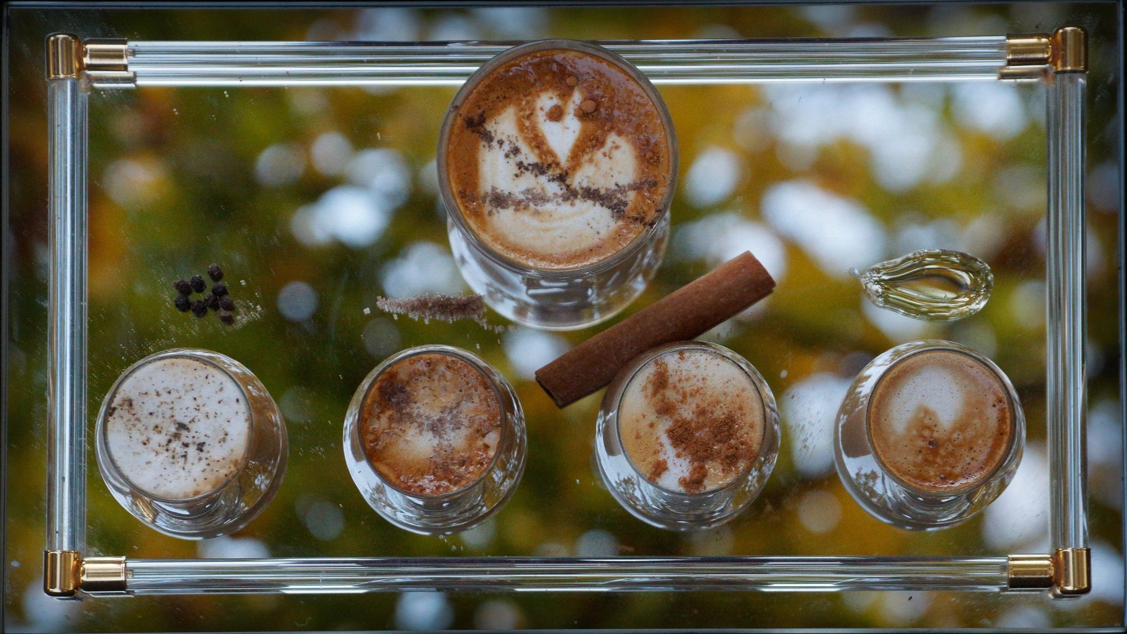
In the early years of Discourse Coffee Workshop the owner Ryan wanted to curate a magical caffeinated creation as a series of flavored shots with four different elements. Each shares the same base with changes in the flavor profile with pepper, brown sugar, cinnamon, and honey. He titled this creation “Moonwater” to signify the differences in the tides, changes during the autumn season amid the trees, and highlighting the vast difference a simple ingredient has to change the flavor of coffee.
